The 'Culturally Appropriate' Blackhawks Logo Of Our Dreams Belongs To A Kids' Hockey Team
By Rachel Cromidas in News on Nov 19, 2015 5:18PM
Logo via Mike Ivall
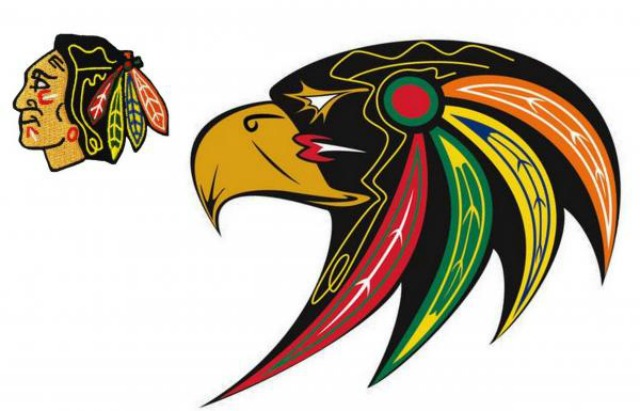
Hands have been wrung and think pieces written over the Blackhawks' logo—a head wearing face paint and feathers that is to evoke the historic American Indian tribal leader Black Hawk.
While some believe Chicago's hockey team's logo is no better than the Redskins, who have been roundly criticized for caricaturing Native Americans, the logo is so far here to stay.
But that doesn't mean a more culturally sensitive Blackhawks logo is out of the question. In fact, an Ojibway artist, Mike Ivall, has reimagined the logo into a beautiful design of a hawk's head decked out in team colors. The design went viral on social media last month, according to the Indian Country Today Media Network, and was shared over 12,000 times on Facebook.
"At the time I was just learning how to use Illustrator and I know how some natives are a little against the native imagery and stuff like that, so I thought, 'Let's just try something out and be literal about it,'" Ivall told the Huffington Post.
Unfortunately, the chances of the Blackhawks adopting the design are even slimmer than we thought: Ivall sold the rights to Ottawa's AAA Hockey team, the Maplesoft Hawks. You can check out the logo, and envy the kids who get to wear it, on their website.
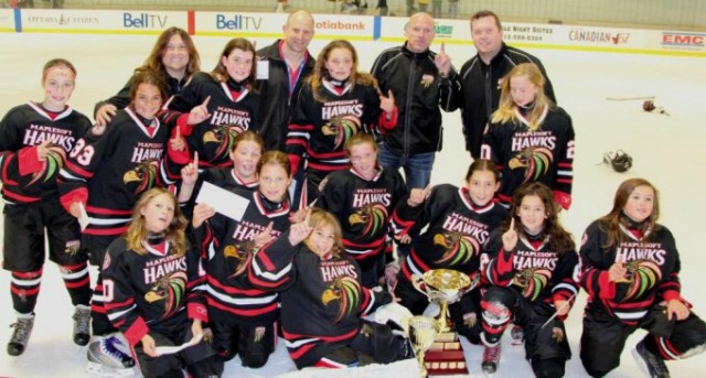
The Maplesoft Hawks